Let's finish this project, because man-alive it is taking a long time! We are on the last part now, so it should go well.
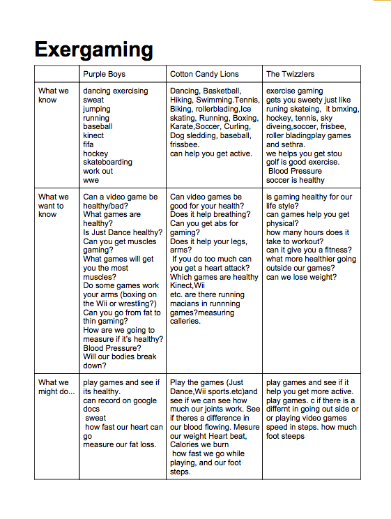
It's up to you what data you use for your Analysis and Conclusion. The charts here have some issues with them (you'll see when you follow the link), and it is likely that your individual data is better. You can use either and still receive full marks.
For the "Analysis and Conclusion" part of the report, begin by telling how you collected data and create visuals that explain the results. For instance, you could include a column chart or a pie graph and you could explain what the numbers mean. This section should clearly connect with your conclusions.
I would suggest using Keynote because it is easy to create graphs and charts, and the visuals look very good with customization.
If you are confused about how to create them, I have made a video tutorial here:
http://keelercommons.weebly.com/keynote-tutorials.html
Here is a link to the communal data:
https://docs.google.com/a/educbe.ca/document/d/1okbyd5y6l1glwWVnpa84XDwIusaUjYfePRW3ZUQK-mA/edit

 RSS Feed
